
What happens when marketing meets science?

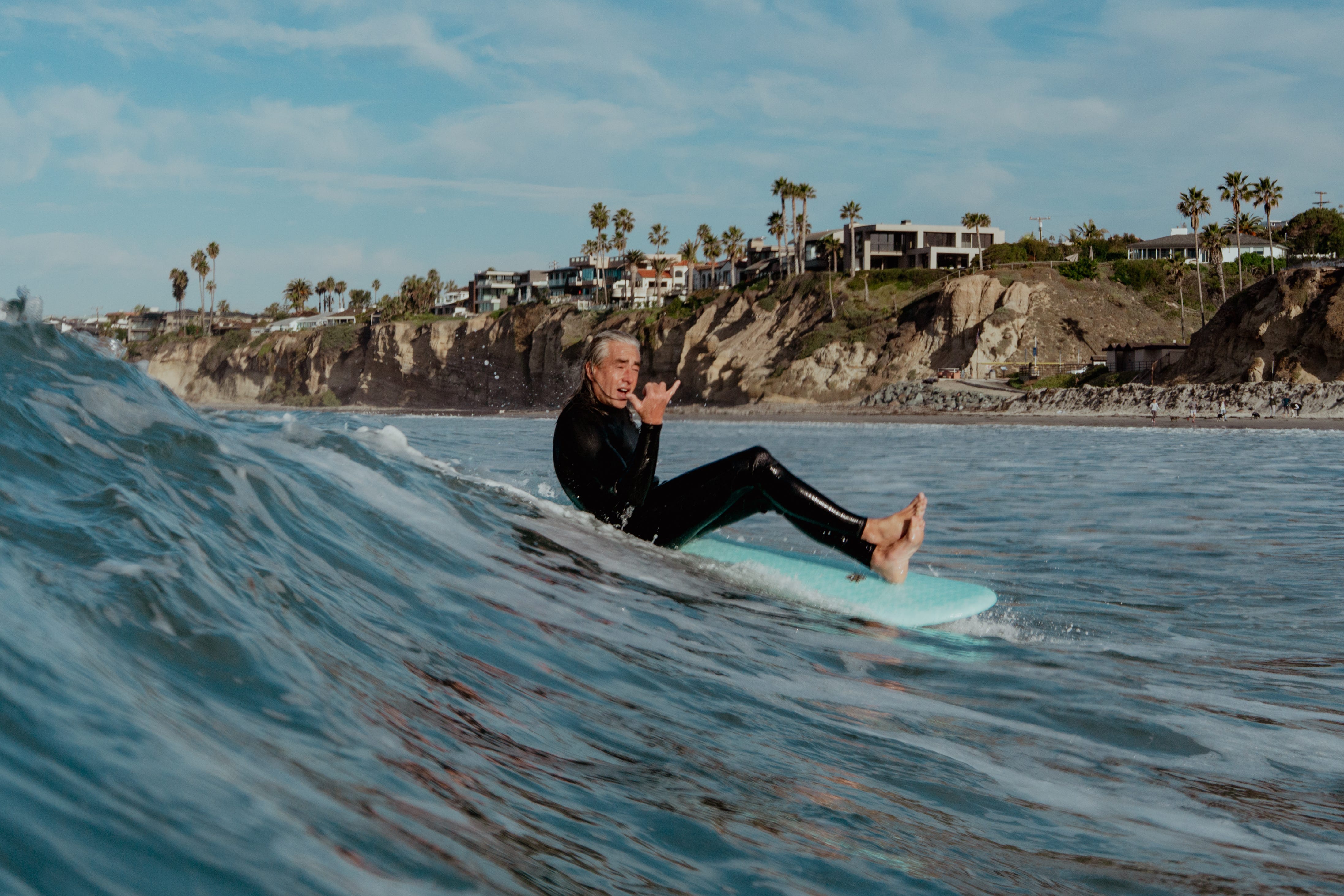
Determining what will happen in a system as complex as weather or the ocean is a Herculean task. Despite the frustration of hearing your buddy brag about the perfect swell you missed—one the forecasts never saw coming—the fact that we can predict ocean conditions with any accuracy remains remarkable.
When discussing surf forecasts, we must address Surfline - the king of the forecasters - directly. This past week, the company released a statement about improvements to their LOTUS model. The model is undeniably impressive, providing forecasts for over 10,000 coastal spots worldwide with fine spatial resolution. Integrating years of surf cam, human observations, bathymetry, and nearshore coastal model data with a machine learning algorithm is insanely difficult and warrants respect for the effort alone.
However, the way they're portraying the model's accuracy is misguided at best, and deliberately misleading at worst. Since this is a rather critical piece, I'll describe their data presentation rather than sharing images that could invite copyright claims.
An example of the bad science in this statement is in the figure they shared from Kirra on the Gold Coast of Australia. Note that their forecast has hourly resolution, yet they are showing 24-hr averages. Although they call this “overall a good fit,” the days that they highlight show a miss of nearly 3x the size on one day and nearly 2x on others. And, in exceedingly poor faith, the legend was used to cover up some of the other bad agreement times - a clear case of data misrepresentation.
To be accepted as meaningful in science, a model requires comprehensive validation—not just a highlight reel of success stories. Surfline's update showcases near-perfect forecasts at select locations and time windows while remaining conspicuously silent about performance across all 10,000 spots for any meaningful length of time. This cherry-picking parallels claiming you're a great surfer because you once caught one wave at Tourmaline on a 1.5ft day.
Let's do some quick math: in this release, they're showing daily data for a cumulative length of 64 days, so that's 1536 hourly data points (although only 25 of those days are directly compared to human observation, thus reducing this number to 600 in any meaningful sense). They have hourly data from over 10,000 sites for the 25-day window that this spans, which equals 6 million data points. This means they're showing roughly 0.01% of their data as it compares to human observations. With the alright-but-not-great agreement they've shown, it makes you wonder how the other 99.99% of the model results during this time window looked.
True model validation involves statistical analysis across all predicted sites, through varied conditions, and over extended time frames. Scientists typically report metrics like root mean square error (RMSE), which measures the average difference between predicted and actual values. They also include correlation coefficients showing how well predictions align with reality and other robust statistical methods of validating trends.
Without these numbers, it's impossible to know if the model is actually improving or just getting lucky during certain time windows. Surfline’s previous statement that the LOTUS model has “reduced errors by over 25%” when compared to its predecessor sounds nice, yet we still don’t know what that error actually is or even what kind of “error” they are referring to.
A transparent approach would publish validation studies showing performance metrics for forecasts at different timescales—24 hours versus 7 days out (see below), for example. It would acknowledge where the model struggles, whether in certain geographic regions or specific wave conditions. Surfline claims "accuracy isn't a 'feeling'" but rather "the result of measuring the gap between what you thought would happen and what did"—yet they don't share these measurements with their customers. The ocean is complex, and no model captures everything perfectly—admitting this isn't weakness, it's scientific integrity.

For surfers, realistic expectations about forecast accuracy are what we are paying for. A model might be 80% accurate at predicting swell height or period at your local break 24 hours out, but only 40% accurate at predicting wave shape or quality. Knowing these numbers helps decide whether to call in sick or save that personal day for more certain conditions.
The forecasting industry faces a fundamental tension between marketing and science, a pressure that I do not envy and which needs acknowledgement. Showcasing only successful predictions drives subscriptions but creates unrealistic expectations and undermines trust when those carefully curated forecasts don't represent average performance. When your dawn patrol turns into trying to see how far you can squirt water with your hands because the "excellent" forecast missed the mark, that erodes your trust in all models, not just the one that burned you. This is similar to how climate change misinformation thrives when predictions seem to fail—overpromising accuracy sows mistrust.
It doesn’t have to be this way - some forecasting services embrace transparency. The National Hurricane Center publishes annual validation statistics, showing clear metrics for hurricane track and intensity forecasts, including their misses. CDIP displays their forecast alongside actual measurements, with years of data freely available. This approach builds credibility—users understand the limitations and make informed decisions based on known accuracy rates. But these are government-and institutionally-funded services, not ones that are asking you for money every year.

The solution isn't abandoning Surfline—it is an invaluable tool even with limitations and I very much respect the efforts they've made to wrangle swell forecasts worldwide. But their marketing needs to adopt scientific standards of transparency for a scientific product, and we need to specifically request that as consumers.
The most troubling aspect of current practices isn't just missed forecasts but the vanishing evidence trail—by altering prediction records after the fact (yesterday's promised "4-5ft and good" becomes today's retroactive "2-3ft and poor" without acknowledgment)1, these platforms eliminate the fundamental basis for validation, creating an artificial illusion of accuracy where we remember the hits but can't quantify the disappearing misses. It's reminiscent of that infamous hurricane path Sharpie image from the president’s first term—revising certainty where none existed.
Publishing comprehensive validation statistics, acknowledging weaknesses, and providing confidence intervals would provide surfers with a much better understanding of what is possible to know and inform us of what service we are actually paying the company for.
There's virtually no competition for Surfline, and people will keep paying because of that, but I hope we see more openness in the future—both for the integrity of surf forecasting and for the scientific literacy of the surf community. But until that happens, we're left reading colorful forecast maps with artificially precise wave heights down to the decimal point, wondering whether we're seeing science at work or just being sold a salty dream.
Further Reading:
Try taking screenshots of the forecast over multiple days and see if you can spot how much it changes. Without confidence bounds, we have no idea if the changes are within the model’s accepted uncertainty range or if it entirely missed the mark.
The sale of salty dreams has been a long term money spinner. In the early days at least you knew who was making the money. Not so much now. Surfline? Owned by a private equity company isn’t it?